


INTRO
Waves Rebrand
I led the rebranding of Waves, a next-gen music platform, to better connect with Gen Z audiences. The goal was to craft a vibrant, bold identity that felt expressive and modern—while staying intuitive and fun to use.
DESIGNS
Visual identity & system
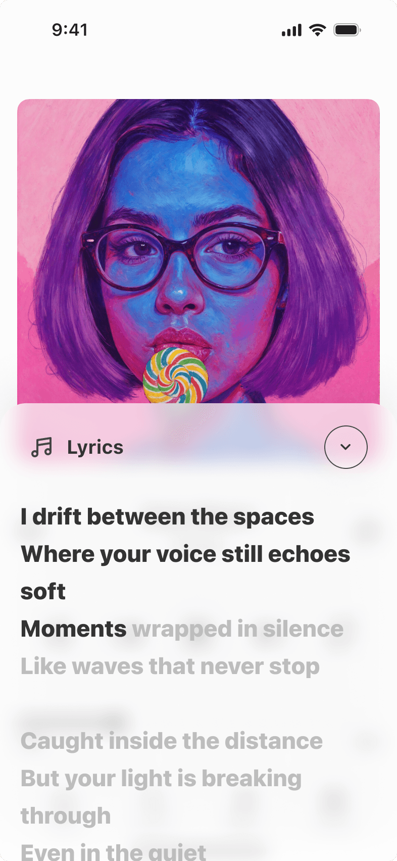
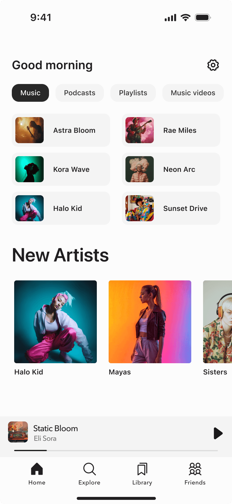
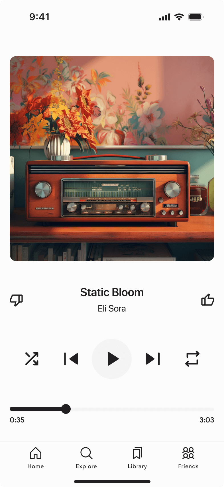
I built a modular system based on vibrant gradients, playful icons, and layered visuals—optimized for use across mobile, social, and marketing. The new identity scaled beautifully across touchpoints while maintaining character.


DISCOVERY
Finding the right tone
The original branding felt outdated and lacked emotional connection with younger users. We needed to strike a balance between expressive visuals and functional clarity, while staying distinct in a crowded space.
Key Insights from User Research
Too Playful for the Target Audience
The brand felt too quirky and cartoonish, making it hard for users to take it seriously.
Lacked Visual Consistency
Inconsistent use of colors and shapes made the app feel messy and unprofessional.
Outdated and Off-Trend
Users described the design as outdated, not reflecting current visual trends or Gen Z expectations.
IDEATION
Exploring directions
We kicked off with a visual audit and competitor analysis. From there, we explored moodboards, ran micro-experiments on color and typography, and gathered feedback from real users through quick visual preference tests.
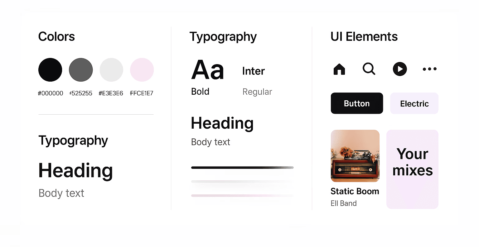
Style Guide

New style look
VALIDATION
Real-world reactions
We validated the system with fast-turn mockups on social media and in-app screens. Feedback confirmed the new direction resonated more with younger audiences and boosted brand engagement metrics within days.
IMPACT
Seeing the results
Lessons
What I learned?
Designing for Gen Z
Requires boldness and clarity. They're fast to judge and value emotional tone.
Simplicity wins
But not at the cost of personality.

